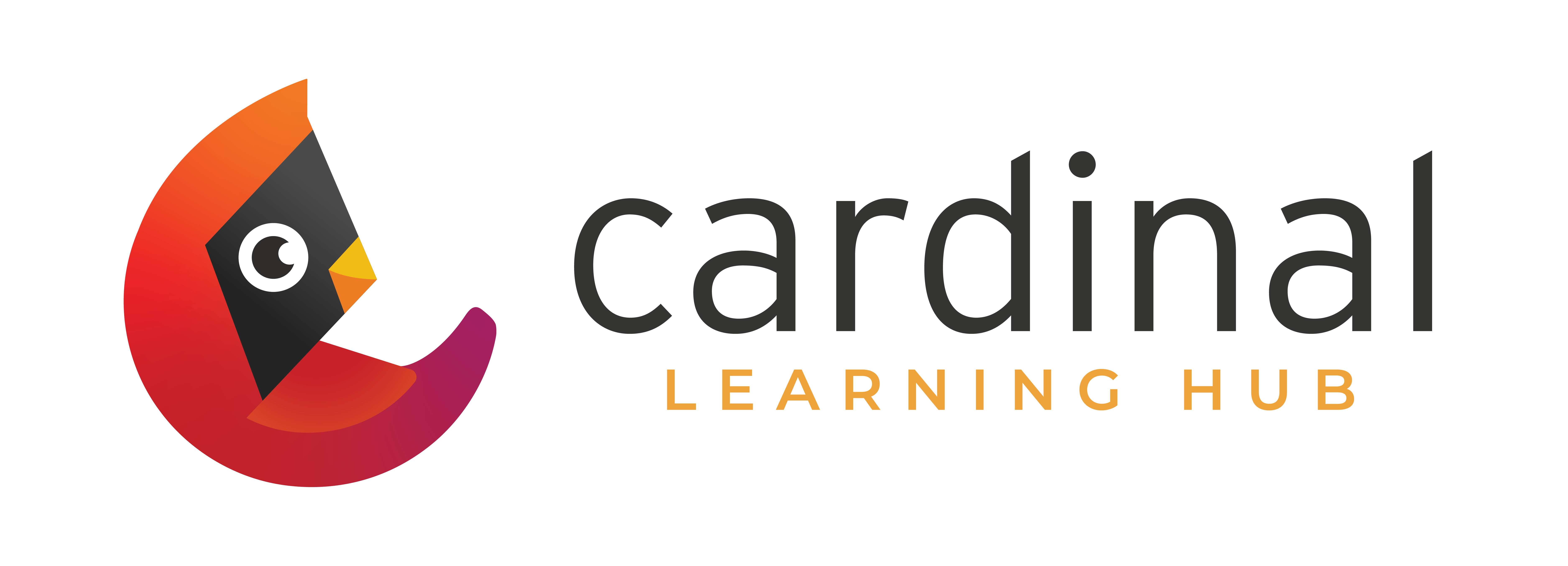
We worked with Sek Design Studio pronounced (smee-shek) to produce the Cardinal Learning Hub logo. It plays on the bird and the definition of ‘cardinal’ which means "of the greatest importance; fundamental.”
The four key elements of this design.
- Incorporates the round and open shape of the letter C.
- Hints of the northern compass reinforce the initiative's name as well as PBS North.
- The palette is a play on the primary colors, which reinforces the idea of education.
- Soft and rounded shapes create a welcoming, warm & approachable icon.
We believe the result is recognizable, and unique and stays true to the personality of the area we serve.
